Over at the Play Date Cafe, we are saying good bye to senior designer Sarah Anderson. While I'm fairly new to joining in at the Cafe, I have always found her designs very inspiring. Good luck on this new leg of your journey, Sarah!
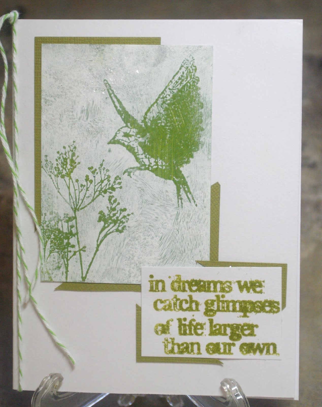
So for this challenge, they have chosen her favorite, the Color Splash, which is black and white, with a splash of green. Unfortunately, mine is not the best representation of this...such plans for a 3 day weekend! Ended up with barely 3 hours of craft time! Thank heavens it finally stopped raining so I could boot my husband out to play golf! LOL! So with everything else that had to get done, graduation, B-days, etc., I just couldn't come up with anything appropriate...I know..weird. So, moving on the the Grungy Monday project at Studio L3, we were playing with the Shabby Chic technique by Tim Holtz. Pretty cool technique! So, while playing with that, I thought, what about green as the background color? Of course you're never really sure what will come through the top color, and the bird was much too green, but at that point, DH would be home soon, and I would need to see about dinner.
So, here it is. The background paint was the Adirondack Dabbers in lettuce, and the text was Adirondack Ink in lettuce; not that they totally match. The overcoat was Snow Cap Adirondack Dabber, with some Picket Fence Distress Stickles smooched over it all. I hope it is acceptable, as this is hardly as "splash" of green, and there is no black at all. And, now that it's uploaded on my work monitor, boy, the greens are so not matching! They are much closer in person--ah well. To really see what "Splash of Color" is all about, head over to the Play Date Cafe and check out everyone else's great works! Have a great week everyone.
I think it is a lovely card and the green worked really well.
ReplyDeleteBeautiful card Kim, the colours work great together. Annette x
ReplyDeleteSuch a lovely sentiment and card! Thanks so much for playing along with us this week at The Play Date Cafe!
ReplyDeleteWho said this isn't the best representation? It's beautiful! I love the way the green tones look in the photo!
ReplyDeletesuch a soft and pretty card Kim, thanks for joining in the fun at the Play Date Cafe this week!
ReplyDeleteWhat a beautiful card--love the green splashes! Thanks so much for playing along with us over at the PDCC and joining in the FUN!
ReplyDeleteIs it just me, or do those wings look like they are actually moving? Beautiful, dreamy card. ;)
ReplyDelete