Showing posts with label Adirondack Ink. Show all posts

Tuesday, May 31, 2011

PDC #83


Over at the Play Date Cafe, we are saying good bye to senior designer Sarah Anderson. While I'm fairly new to joining in at the Cafe, I have always found her designs very inspiring. Good luck on this new leg of your journey, Sarah!


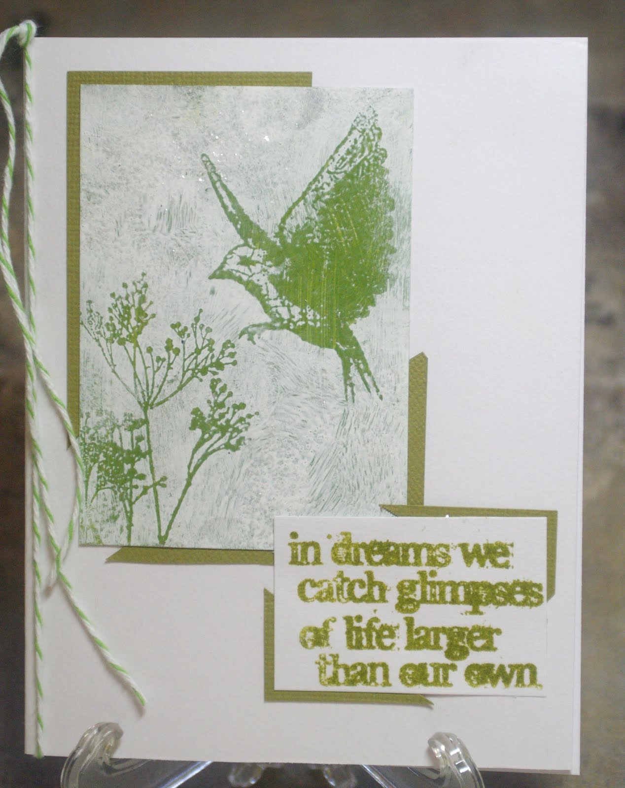
So for this challenge, they have chosen her favorite, the Color Splash, which is black and white, with a splash of green. Unfortunately, mine is not the best representation of this...such plans for a 3 day weekend! Ended up with barely 3 hours of craft time! Thank heavens it finally stopped raining so I could boot my husband out to play golf! LOL! So with everything else that had to get done, graduation, B-days, etc., I just couldn't come up with anything appropriate...I know..weird. So, moving on the the Grungy Monday project at Studio L3, we were playing with the Shabby Chic technique by Tim Holtz. Pretty cool technique! So, while playing with that, I thought, what about green as the background color? Of course you're never really sure what will come through the top color, and the bird was much too green, but at that point, DH would be home soon, and I would need to see about dinner.


So, here it is. The background paint was the Adirondack Dabbers in lettuce, and the text was Adirondack Ink in lettuce; not that they totally match. The overcoat was Snow Cap Adirondack Dabber, with some Picket Fence Distress Stickles smooched over it all. I hope it is acceptable, as this is hardly as "splash" of green, and there is no black at all. And, now that it's uploaded on my work monitor, boy, the greens are so not matching! They are much closer in person--ah well. To really see what "Splash of Color" is all about, head over to the Play Date Cafe and check out everyone else's great works! Have a great week everyone.

Thursday, May 26, 2011

Grungy Monday--so good to me....(hmmm, hummm)


Don't ask..the music in my head has taken over today--The Mama's and the Papa's..good stuff!


So, to my other art medium....Lovely Linda at Sudio L3 has set us with one of my most fave, go-to techniques EVER! Tim Holtz's September Technique Challenge-2008. Really! Click on the link and check it out!


However, in keeping with my decision to work in my 7 gypsies ATC tray format...complications arose. You can check my previous post on WOYWW to see the fall-out! LOL! Either it was the small size, and wanting to use stamps that where too big, or the use of the white space, or lack there of on the ATC size--either way, not thrilled with the end result. The stamps are--I swear, though they are not on the website, from the Stampsmith. And I seemed incapable of shooting a straight picture! LOL!


So , a quick peek at my tray to date--and then go check out Tim's technique--there is still time! Have a great crafty week everyone!

Monday, May 9, 2011

Play Date Cafe Challenge #80


The Play Date Cafe is up to week 80! This week the colors are red, orange and white. I've missed the last few PDCC's due to an AWOL Muse. She's still not around (I think she's on a cruise ship drinking mojitos and bahama mama's, which is where I should really be!) but I felt I really needed to jump back in. And what a struggle this week was!! I'm not sure why, as I really like these colors--maybe because I usually don't use them together?


So after many hours of thinking (yeah, really, since it was announced!) on Saturday I went up, and started pulling out papers--nothing moved me. Went to stamps, and found this set from Sunday International--had them for years, and they weren't even mounted yet! Since coloring is a challenge for me, I didn't want to go that route (though there is one single really nice goldfish, but I didn't have any sayings I felt went with it) so then I thought of the alcohol inks..and bam--a plan was in place! LOL! If Only! 2 sheets of glossy later--I finally got a background I liked. I had heard that you couldn't mix the Adirondack AI's with the Pinata AI's. Can't remember why--different types of alcohol base maybe? But I only have the Peach Belini and Cranberry Adirondacks that would fit, as Butterscotch and Terra Cotta just didn't, and the Pinata had Chili Red and Tangerine. But the tangerine came in too yellow, so I had to add the Peach to "orange" it up. I used the mono print technique from the Compendium of Curiosities, and the two types seemed to play nice. It seemed to be the clear solutions that didn't go well. I then embossed with white EP, layered on a chili-red paper, the tried dyeing the ribbon to become orange. That didn't work out quite as well- it sorta came out rusty.


It is a white card underneath it all, but my image came out much darker, and it looks sorta dark cream/pale orange to me, at least on this monitor! (I really need to calibrate my camera view screen, my home computer monitor, and my work monitor! LOL!) So, with all said and done--I really need my muse to come home! I have some serious crafting to get done! So jump over to the Cafe and see what wonderful works of art everyone else came up with-and jump on in! Happy Crafting everyone!

Saturday, March 12, 2011

The Playdate Cafe #72


Ok, in real life, these colors are true..well, the pink is a bit paler on the tag, but richer on the label..in real life thank what the photo looks like to me. I don't know if the camera needs an adjustment, or eye (lol) do! (Sorry, really punchy today--every critter in this house is driving me bonkers!)


But, speaking of punchy...this is not how I envisioned this project..it was supposed to be a flowery card, but first...I just had to play with my new Tim Holtz Butterfly dies!! I quickly glued two pieces of scrap together to cover them, and OMG! How fantastic are those butterflies!!! It wasn't until I went to put them in my little "pieces-parts" drawer for future use that I realized; they were Orange and Blue..so I just had to use them!
I had also ordered Tim's new Labels stamp set...so the Florist one seemed a natural fit...and then earlier this week I used Penny Black's Brushstroke Lily, which was still on my desk, so that became the main image. It is a technique showcased by Tim Holtz on his first DVD, using Adironadack Inks and a water mister. Very cool, particularly on the Brushstroke images! The tag background and the label background are DI Spun Sugar and Victorian Velvet, with Broken China around the edges. The Adirondack Inks are Denim, Bright Orange and Terra Cotta. Not real crazy about the blue stems, but what are ya gonna do? So..Ta da..my Play Date Cafe entry for the week. Now hop on over to see what everyone else has created using the fab colors of Orange, blue and Pink! Have a great weekend everyone!